Every September, the bins come down from the attic. Wreaths, garlands, ceramic pumpkins, the little sign about spice. Every late November, it all goes back up, and the mantel that looked warm for ten weeks looks bare for the next forty. This is the seasonal decorating cycle, and most households run it on autopilot without asking the obvious question: why should loving autumn mean decorating on a timer?
There is a way out, and it hinges on a distinction worth learning: the difference between autumn’s props and autumn’s palette.
The seasonal decorating trap
A prop is an object that names a date. A pumpkin says October. A sprig of holly says December. A pastel egg says April. Props are effective precisely because they are so legible, and that legibility is also their expiry mechanism: the same clarity that makes a pumpkin perfect on Halloween makes it absurd in February. Decorate with props and you have signed up for the churn: boxes, storage, the seasonal aisle, and walls that spend most of the year in transition.
A palette, by contrast, names nothing. Rust, ochre, umber, marsh gold, slate: these are autumn’s colours, but they are also simply earth tones, the oldest and most durable neutrals in interior decorating. Leather is autumn-coloured. Walnut is autumn-coloured. Brass, terracotta, aged brick: autumn, all of it, and nobody packs those away in November. Colour does not expire. Subject matter does.
The trap, then, is buying autumn’s calendar when what you wanted was autumn’s warmth.
What makes autumn art work in April?
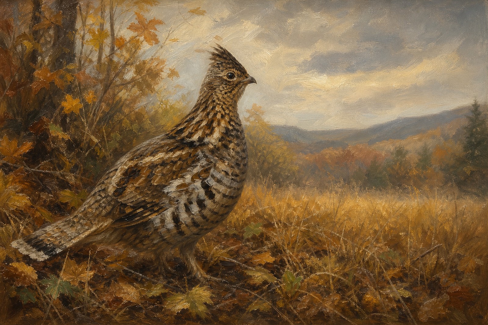
The test for any autumn-toned piece is simple: does the subject name a date, or does the palette carry the mood? A print of a jack-o-lantern fails the test instantly. A wheat-sheaf-and-banner gallery wall fails it slowly. But a landscape in autumn colour, a marsh in gold reeds under a moving sky, passes it completely, because a landscape is a place, not a holiday. In May it reads as a warm landscape. In October it reads as the season itself. The print has not changed; the calendar has, and the art simply absorbs it.
This is the quiet advantage wildlife and landscape art holds over decorative seasonal pieces, and it is why the most durable autumn walls are built on subjects that would hold up in any month: fields, marshes, rivers, and the birds that use them.
Migration: autumn’s subject, without the calendar
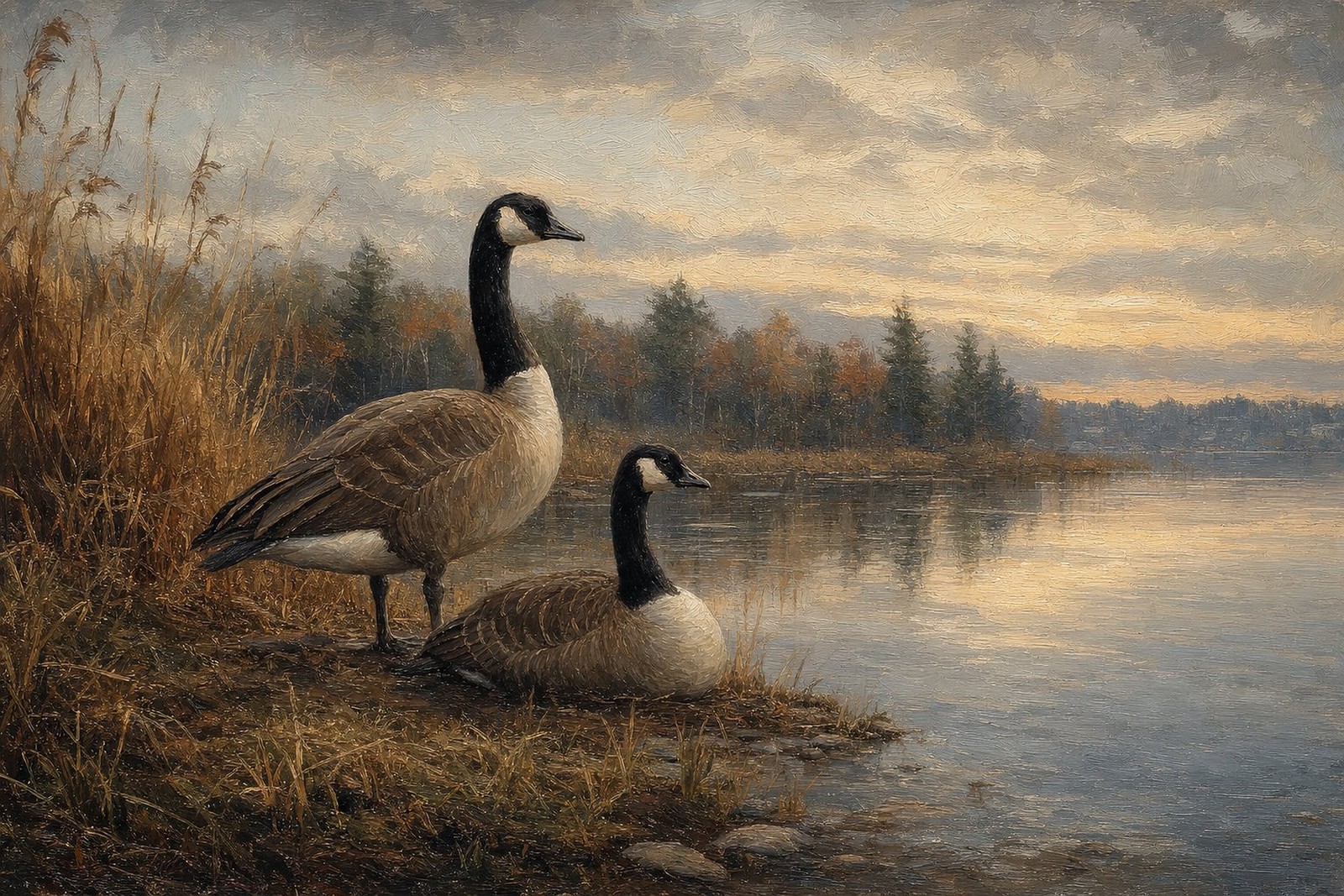
If autumn has a signature event in the natural world, it is not the pumpkin harvest. It is migration. Geese crossing an amber marsh is the most autumnal image in American skies, and yet it carries none of the holiday baggage, because migration is a wild event rather than a human one, and not even an exclusively autumn one. The birds pass through twice a year, south in fall and north in spring, a rhythm we cover in detail in our post on when Canada geese actually migrate. Hang a migration scene and you have hung a subject genuinely about movement, weather, and season, with no date stamped on it anywhere.
Our featured composition makes the case: Canada geese over an autumn marsh, gold and umber reeds below, birds rising through low light. It is unmistakably autumn and yet entirely a landscape, which is exactly the balance a year-round wall needs. The routes those birds are travelling are a story of their own; the continent’s great migration flyways funnel millions of waterfowl down the same corridors every fall, and a large share of classic American sporting art was made along them.
For walls, the working formula is this: choose the season’s event, in the season’s palette, and skip the season’s merchandise. Our migration art in autumn palettes is built around that formula, marsh golds and rust tones that read as warm neutrals from January to December.
Building the room around the palette
Autumn tones are among the easiest colours in decorating to serve, because the materials most homes already contain are on their team.
The living room. Anchor the main wall with a 20x30 autumn marsh scene, then let the room echo it in things that never get packed away: a rust cushion, a camel throw, a walnut coffee table. Seasonal props can still visit the mantel in October; the difference is that when they leave, the room keeps its warmth.
The entry. An autumn-toned print above a timber console makes a permanent first impression of warmth. Add a brass lamp and the scheme is complete in three objects.
The dining room. Umber and gold deepen beautifully after dark. A gold-framed marsh scene under dimmed light does what a centrepiece of gourds tries to do, and does it in February too.
The office. Autumn palettes read as serious without being cold, which is why studies and libraries have leaned on browns for centuries. A migration scene adds the one thing bookshelves lack: weather.
The bedroom. Autumn tones are naturally low-glare, and a marsh scene in umber and gold above a headboard warms a room at exactly the hours it is used, morning and evening, when the light is low and the palette is at its richest. Pair it with oatmeal linen and the scheme finishes itself.
Wall colours that serve the palette: warm white, oat, olive, deep green, and, for the confident, a near-black green that makes gold reeds glow. The frame choice follows the room: brown deepens the earth tones, gold warms and formalises them, black modernises the whole arrangement. None of this needs replacing in December, which is the entire argument of this post in a single sentence.
The honest details
Every print is an original AI-created artwork in the style of antique oil painting, which is a style chosen for exactly this job: layered, glowing colour that flatters low autumn light and reads as traditional without pretending to be old. We are plain about what the work is on every listing. Prints are made to order and dispatched in 2 to 5 business days, in three landscape 3:2 sizes printed edge to edge with no mats: $59, $89, and $119 unframed for 12x18, 16x24, and 20x30; $189, $259, and $329 framed in black, brown, or gold; $19 for a digital file. Shipping is free to the US, Canada, the UK, Europe, Australia and New Zealand, and a 30-day guarantee covers replacement or refund for anything damaged, defective, or wrong on arrival.
Frequently asked questions
Is autumn-toned art too dark for a small room?
No, as long as the wall stays light. Umber and rust art on a warm white or oat wall adds depth without shrinking the space. The combination to avoid in a small room is dark art on a dark wall, which reads as a single heavy mass.
Which frame colour suits autumn palettes best?
Brown is the natural ally, extending the print’s own tones. Gold adds formality and glow, especially in dining rooms. Black works where the rest of the room is modern and you want the art to have a defined edge.
Can I still decorate seasonally around a year-round piece?
That is exactly the system. The art holds the wall all year; the props, the wreath, the gourds, the candles, visit for their few weeks and leave. The room never has an off-season, because its foundation was never seasonal to begin with.
Do geese only migrate in the fall?
No. The southbound push from September through November is the famous one, but the same flocks return north in spring, and some populations now stay put year-round. As a subject, migration is a two-season event with a year-round presence.