Every house over a certain size has one: the hallway that feels less like a room and more like a distance to be covered. Guests walk it quickly. Nobody lingers. The lighting is flat, the walls are long and bare, and the far door pulls every eye straight to itself the moment anyone steps in. Long hallways feel wrong for a predictable set of reasons, which is good news, because predictable problems have repeatable fixes, and the best one costs less than almost any other change you could make to a house.
Why does a long hallway feel like a corridor?
Three things are working against you. First, perspective: parallel walls converging toward a far door create the strongest vanishing-point effect in the whole house, and the eye rides those lines to the end whether you want it to or not. Second, blankness: with nothing along the route to pause on, the trip reads as pure transit, which is exactly what corridor means. Third, narrowness: you cannot step back from the walls, so anything hung there is seen close up and at an angle, conditions most art was never chosen for.
Notice that none of these problems is about the hallway being long. They are about the hallway being empty. Length is actually the asset; it is the one wall in the house big enough to hold a sequence.
Rhythm and repetition: the run of prints
The classic fix is one of the oldest moves in decorating: a run of same-size, same-frame pieces, evenly spaced down the wall. Architects have used the equivalent for centuries in colonnades and panelled galleries; a rhythmic series breaks a long distance into bays, and the walk acquires a beat. The eye stops sliding to the far door because it now has somewhere to land every few feet.
Repetition is what makes it work. Identical sizes, identical frames, even spacing: the discipline is the design. Vary the frames and sizes and you have a gallery wall, which is a fine thing but a different one, busier and better suited to a stair or a den. In a corridor, uniformity reads as intention, and intention is precisely what a transit space lacks.
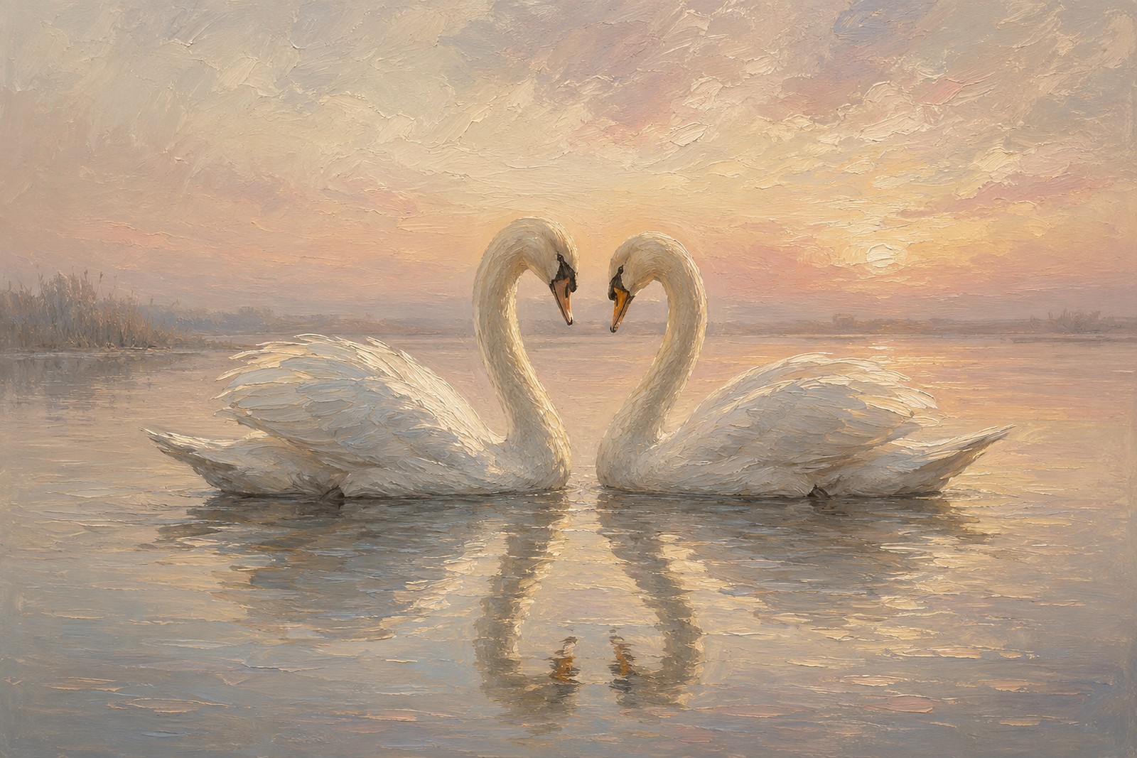
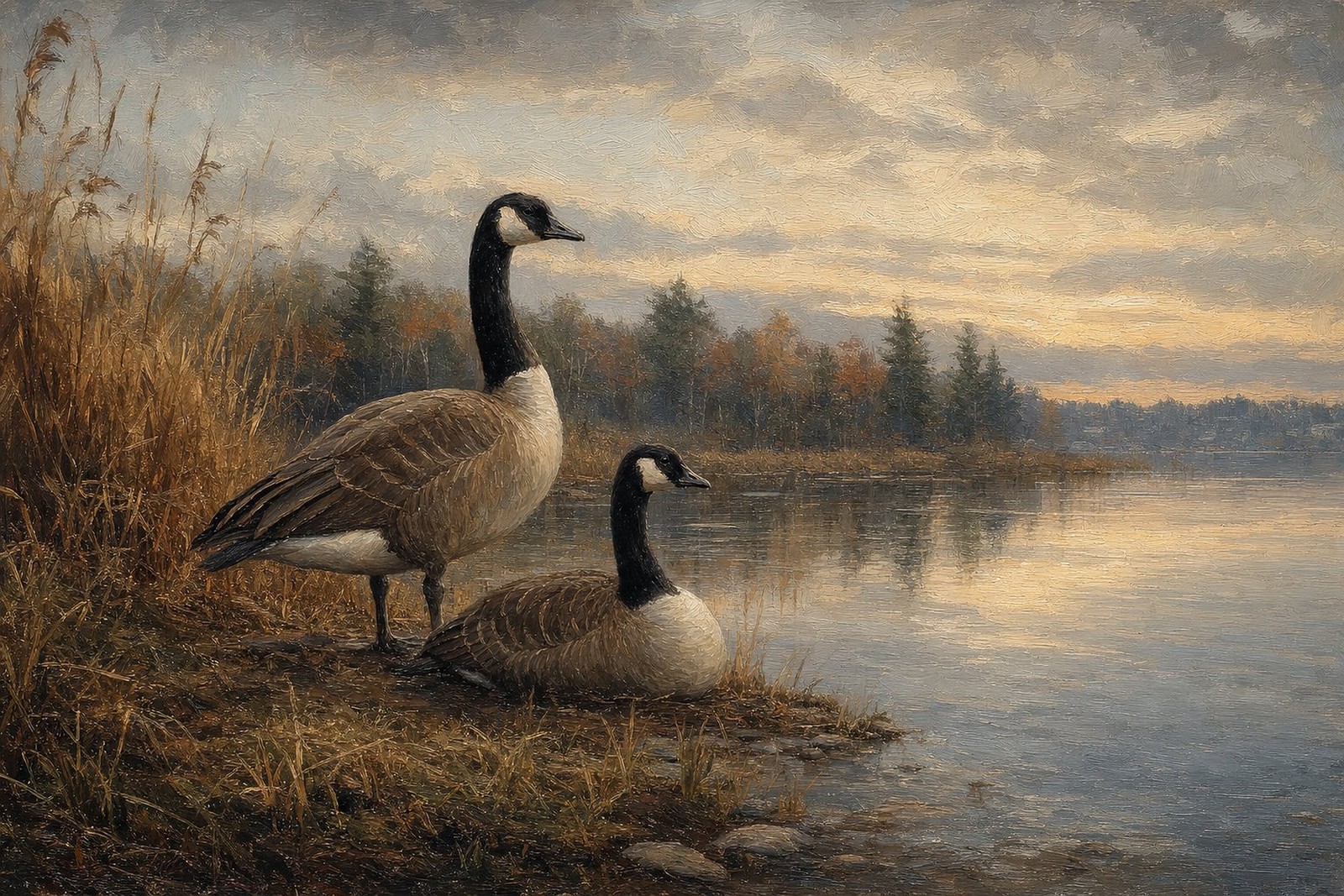
Orientation matters more here than anywhere else in the house. In a narrow hall, art is viewed at an angle as you approach and pass, and wide, landscape-format images stay legible under that treatment far better than tall ones. Verticals also repeat the hallway’s own proportions, tall and narrow, and quietly make the problem worse. A 3:2 landscape print does the opposite, pushing the eye sideways and visually widening the wall it hangs on. This is a large part of why our landscape-format goose prints take so naturally to hallway duty: waterfowl scenes are built wide, sky and water running edge to edge, and a run of them turns a corridor into something closer to a row of windows.
A series also wants a subject with a through-line, and migration is nearly custom-made for the job: geese at first light in the first frame, on the wing in the second, settling onto water in the third. The hallway becomes a journey about a journey, which is a quietly satisfying thing to walk past every day.
How do you hang a hallway series properly?
Height. Centre every print at 57 to 60 inches from the floor, the standard museums use, and keep that centreline identical down the whole run. In a hallway there is no furniture to negotiate with, so the rule applies cleanly.
Spacing. Measure, do not eyeball. Decide the gap once and repeat it exactly; even small drift is visible down a long sightline. Let the architecture set the bays where it offers them: one print centred between each pair of door frames is an arrangement that never looks wrong.
Count. Three to five prints suits most halls, and odd numbers resolve more naturally than even ones, since an odd run gives the eye a centre.
Size. 12x18 is the workhorse for a standard-width hall in a run of three or five. If the hallway is generous, a run of 16x24 carries more presence. Save 20x30 for the end wall, which brings us to the real trick.
The sightline anchor: the wall at the end
That far wall the perspective lines all point at is not the enemy. It is the stage. Since every eye in the hallway is delivered there automatically, give it something worth arriving at: the largest piece in the scheme, hung centred, ideally with its own light.
This is where a pale, luminous composition earns its keep, especially in halls that lack a window. A print full of morning light behaves like borrowed daylight at the end of a dim run. Our featured scene, Ross’s geese in a pale morning sky, is built for exactly this position: small white geese, soft silver-gold light, a composition that reads like an opening rather than a wall. The bird itself is worth knowing too, the daintier northern cousin of the snow goose, and our field guide to the Ross’s goose covers it properly.
If your hallway ends at a stairwell rather than a wall, the logic flips: that is the one spot where a tall vertical piece beats a landscape one, and our heron prints guide covers that exact situation, since a standing heron is the classic tall-and-narrow solution.
Choosing the sequence for your hall
Dark, windowless halls want pale prints: morning skies, winter light, silver water. Light subjects do real optical work in dim spaces, and the difference is visible the day they go up.
Bright halls can afford depth: autumn marsh tones, low evening light, umber and gold. A sunlit corridor is one of the few places dark art never feels heavy, because the space itself supplies the light.
Either way, one style throughout. A run only reads as a run if the pieces speak the same language. Every print in our collection is an original AI-created artwork in the style of antique oil painting, in the same 3:2 landscape format, printed edge to edge with no mats, which is exactly the consistency a matched series depends on.
The practical details
The arithmetic is friendlier than most hallway makeovers. A run of three 12x18 prints is $177 unframed, or $567 framed in matching black, brown, or gold. A 16x24 run of three is $267 unframed. The 20x30 anchor for the end wall is $119 unframed or $329 framed. Digital files are $19 each if you would rather print and frame locally. Everything is made to order, dispatched in 2 to 5 business days, ships free to the US, Canada, the UK, Europe, Australia and New Zealand, and carries a 30-day replacement or refund guarantee against arriving damaged, defective, or wrong.
Frequently asked questions
How many prints does a long hallway need?
Three to five covers most homes. Count the natural bays, the stretches between door frames, and place one print per bay rather than forcing a fixed number. An odd count reads best when the wall is unbroken.
What height should hallway art hang at?
Centre each piece at 57 to 60 inches from the floor and hold that line down the entire run. Consistency matters more than the exact number; drift is what the eye notices in a corridor.
Should every frame in the run match?
Yes. Matching frames and sizes are what turn separate prints into a single architectural gesture. Mixed frames belong to the gallery-wall look, which suits stairs and dens better than narrow corridors.
Can I mix subjects within the series?
Keep one family and one style, then vary the composition. Geese at rest, geese in flight, geese on water: that reads as a sequence. A goose, a lighthouse, and a botanical reads as a collection, and the rhythm dissolves.