Real estate files them under the same word: waterfront. Decorating treats them the same way at its peril. A beach house and a lake house sit beside two different kinds of water, under two different kinds of light, and they ask for two different rooms. Most of the waterfront decor that goes wrong goes wrong here, with anchor motifs hung beside a freshwater lake or moody pine-dark art fighting a sun-bleached coastal room.
The good news is that the difference is easy to learn, because it comes down to three things: the palette, the mood, and the birds. Get those right and everything else follows.
Two kinds of light
Start with what the water does to light, because everything else is downstream of it. The sea throws light around. Sand reflects, surf reflects, and the horizon is a long bright line, so a beach house lives in glare. Its whole colour scheme is an adaptation: whites, pales, and faded tones that can stand the brightness, like everything on the beach itself, bleached a shade lighter than it started.
A lake absorbs light. Deep fresh water reads nearly black, conifers soak up whatever reaches the shore, and the memorable hours are the dim ones: mist at six in the morning, amber lamplight at nine at night. A lake house palette is an adaptation too, built to glow in low light rather than survive bright light.
That single difference explains most of the decorating rules that follow.
The beach palette vs the lake palette
The beach house palette: white, sand, seaglass green, faded denim blue, driftwood grey. Nothing saturated, everything sun-washed, with pale timber and linen doing the textures.
The lake house palette: pine green deep enough to read black, granite grey, birch white, dark water, warm amber, with one loud red allowed, traditionally the canoe. Timber stays honey-toned rather than whitewashed, and wool replaces linen.
Put side by side, they are almost opposites: one palette is light diluted, the other is light concentrated. This is why art migrates so badly between the two houses. Each palette wants art mixed from its own colours.
Two moods
The palettes produce two temperaments. A beach house is open and social: windows up, doors ajar, sandy feet, big daylight rooms that empty onto a deck. Its art can afford to be bright, breezy, and a little loose.
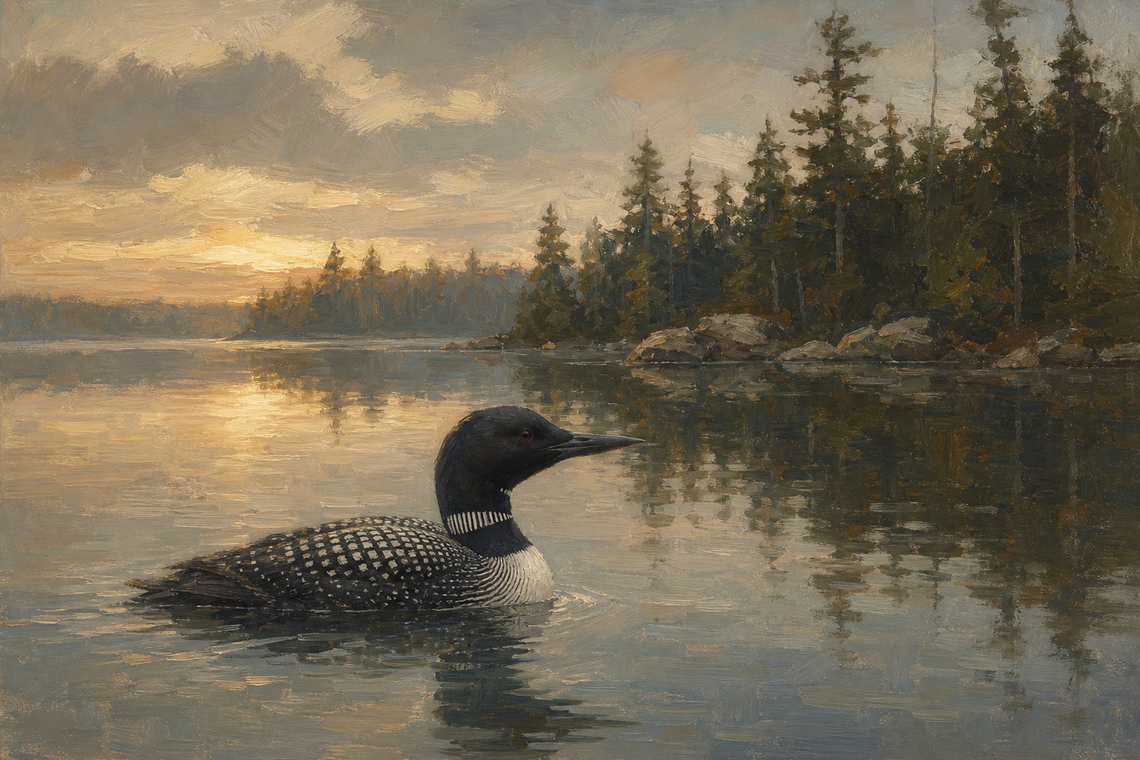
A lake house is sheltered and inward: trees close around it, evenings organise themselves near a fire, and the signature sound is not surf but stillness with a loon somewhere in it. Lake house art wants depth and quiet: dark water, held light, compositions that reward the tenth look rather than the first.
Neither mood is better. But knowing which one you are furnishing saves you from the classic mistake, which is buying cheerful coastal art for a house whose whole character is dusk.
Which birds carry a beach house?
The shorebirds and the big coastal fliers. Sanderlings chasing the surf line bring motion and comedy. A piping plover on pale sand is the beach palette in bird form. The brown pelican, patrolling in formation, is the coast’s great silhouette. Oystercatchers add the one sharp graphic accent, and the reddish egret, dancing after fish in the shallows, is pure beach-house energy. These are birds of open light and open space, and they keep a bright room lively without fighting it. Our coastal wall art guide walks the full shoreline roster.
Which birds carry a lake house?
The divers and the northern waterfowl. The loon comes first, and honestly the loon is the argument in one bird: black and white, quiet, built for dark water, freighted with everything a lake means to the people who keep going back to one. Around it sit the hooded merganser in its woodland pool, the wood duck in colours no beach bird would dare, the goldeneye for winter, the grebes for the small quiet rooms, and trumpeter swans where the lake house leans formal.
These birds hold their own against timber walls and low light, which is precisely what beach-bird art cannot do. You will find them gathered on the lake-bird side of our collection, loons and grebes and their marsh neighbours together.
Which prints work in both houses?
A few birds hold dual citizenship, and they are worth knowing because they solve real problems: the brackish-bay house that is neither fully coastal nor fully lake, the owner of one of each who wants continuity, the gift buyer hedging sensibly.
The great blue heron is the master key. It stalks tidal creeks and lake coves with equal conviction, and its blue-grey plumage sits comfortably in both palettes, which is much of why it became the default waterfront bird in the first place. Our heron print guide covers it in full. The great egret works the same trick in white. The belted kingfisher perches on weathered dock posts in both worlds, and docks are docks everywhere. And swans read as water in general rather than any particular kind of it.
If you need one print to serve both moods, choose from this group and let the frame do the local tailoring: black or a lighter treatment for the coast, brown for the lake.
The practical part
Every print in the shop is a 3:2 landscape printed edge to edge, no border and no mat. Unframed: $59 for the 12x18, $89 for the 16x24, $119 for the 20x30. Framed in black, brown, or gold: $189, $259, $329. A digital download is $19. Each piece is an original AI-created artwork in the style of antique oil painting, made to order, dispatched in 2 to 5 business days, with free shipping to the US, Canada, the UK, Europe, Australia, and New Zealand, and a 30-day replacement or refund if anything arrives damaged, defective, or wrong.
Frame guidance follows the palette logic above. Black is crisp in bright coastal rooms and modern lake houses alike. Brown belongs to timber, which usually means the lake. Gold suits the formal ends of both worlds, the panelled coastal dining room and the lodge with leather chairs.
Frequently asked questions
Is lake house decor just rustic beach house decor?
No, and treating it that way is the most common waterfront mistake. Beach style is light diluted: whites, pales, sun-bleached tones. Lake style is light concentrated: pine, granite, dark water, amber. They share a fondness for timber and a view, and almost nothing else.
What colours tie a lake house room together?
Start from the landscape’s own list: deep pine green, granite grey, birch white, near-black water blue, and warm amber. Keep walls and big furniture inside those tones, allow one saturated red accent, and choose art mixed from the same colours. The room will feel inevitable rather than decorated.
What about a river house?
Split the difference, leaning lake. Rivers share the lake’s enclosed, tree-shaded character but add movement. Kingfishers, mergansers, and herons are the natural river birds, and the lake palette works with slightly lighter timber. The one thing a river house never wants is seashell decor, which reads as a navigation error.
What size print works above a sofa?
The 20x30, hung so its centre sits at standing eye level and the bottom edge clears the sofa back by about a hand’s width. On a wide wall, a 20x30 flanked by two smaller pieces beats three mid-sized prints, which tend to read as clutter. In both houses, one confident piece is the move.